In a normal (e.g. client) website project, we have an idea on how many menu items will appear in the menu. But, when you’re developing a default theme for Drupal core, any assumptions get thrown out the window. We have no clue how many menu items the user will add.
How do we handle this ?
Two different Olivero menu styles
Like many websites, Drupal’s new default theme (called Olivero) supports two different menu styles.
The “desktop” style aligns the menu items horizontally, and has limited space for menu items.
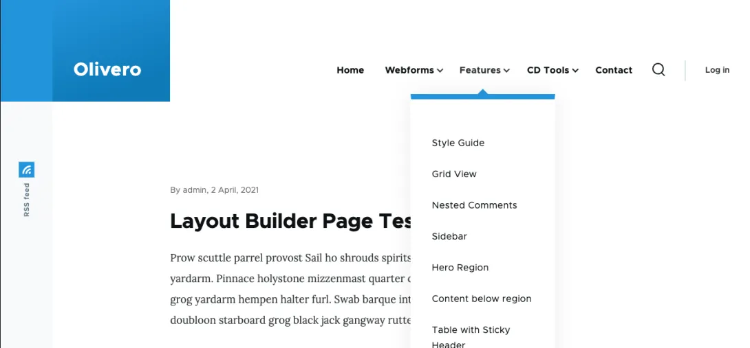
The “mobile” style aligns the menu items vertically, and because of scrolling, can hold an unlimited amount of menu items.

At smaller “mobile device” widths, we default to the mobile menu, and then we default to the “desktop” style at viewport widths larger than 1000px.
If you have a lot of menu items
If you know your site is going to have too many menu items for the desktop version, you can default to the mobile menu at all screen widths. This configuration is available within Olivero’s theme settings at /admin/appearance/settings/olivero
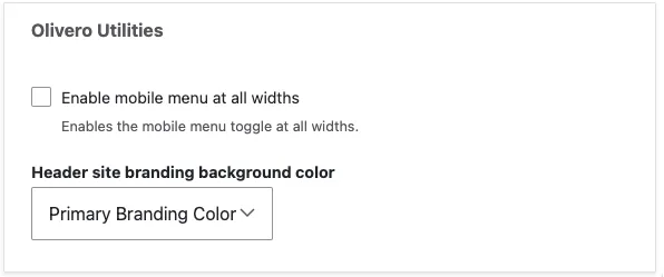
This adds an is-always-mobile-nav CSS class to the <body> tag that tells the browser what menu style to use.
If you don’t know whether the menu items will fit
Menus are tricky, though. There’s a weird spot where the menu items will fit horizontally at wide widths, but then wrap when the viewport shrinks slightly. To be honest, it looks straight up ugly.
What can we do about it ?
We know that this will have to be handled in CSS or JavaScript, because Drupal doesn’t have any ability to know how wide the viewport is. Luckily, all we have to do is toggle the same CSS class that enables the “always on" mobile navigation. The tricky part is triggering it under the right circumstances.
Performance implications of detecting the position of menu items
Detecting overlap or distance between elements is possible, but requires Element.getBoundingClientRect(), which can trigger a layout operation in the browser. This can be expensive from a performance perspective, and potentially make the theme feel sluggish on older devices.
Detecting changes via ResizeObserver
The solution to this comes through the browser’s built in ResizeObserver interface (note this doesn’t support IE11).
ResizeObserver triggers when the size of the observed element (in this case the primary nav) changes. From the video above, we know that the height changes because the elements wrap (due to flex-wrap: wrap).
To determine if we should turn on the mobile navigation, we compare the height of the entire menu (this is returned in the callback) to the height of an individual menu item. If the menu height is greater, then we know the menu has wrapped.
function checkIfDesktopNavigationWraps(entries) {
 const navItem = document.querySelector('.primary-nav__menu-item');

 if (Drupal.olivero.isDesktopNav() && entries[0].contentRect.height > navItem.clientHeight) {
   document.body.classList.add('is-always-mobile-nav');
 }
}
This works well for enabling the mobile menu. But, how do we re-enable the desktop menu in the event that the user is resizing their browser window from wide, to narrow, and back to wide?
We know we need to remember the width of the viewport. This is straightforward by querying window.innerWidth. But, how should we monitor the width?
We can add a resize event listener to the window, but this is unnecessarily heavy, and (like before) can make the browser feel sluggish if the user is busy resizing their window (who does this???).
A better way is to add an event listener to window.matchMedia(). This interface has the ability to watch for a change event that will let you know if the media query has changed. This method is much more lightweight than using a resize event listener! We also pass in once: true to ensure that this event listener is removed when it is triggered.
function checkIfDesktopNavigationWraps(entries) {
 const navItem = document.querySelector('.primary-nav__menu-item');

 if (Drupal.olivero.isDesktopNav() && entries[0].contentRect.height > navItem.clientHeight) {
   const navMediaQuery = window.matchMedia(`(max-width: ${window.innerWidth + 15}px)`);

   document.body.classList.add('is-always-mobile-nav');

   navMediaQuery.addEventListener('change', () => {
     transitionToDesktopNavigation(entries[0].target, navItem);
   }, { once: true });
 }
}
It works great!
Wrapping up (pun intended)
I’m really happy with this solution! There are a couple edge cases, and “gotchas” taken care of in the production code, but because Drupal is free and open source, you’re welcome (and encouraged) to look at it yourself within the Drupal codebase. The file is pretty well documented by yours truly.
Special thanks to KarinG who prodded (and funded) me to work on this, and to everyone else who contributed to the issue.
Hey you! Leave a comment!
Seriously... I really like it when people let me know their thoughts and that they've read this.